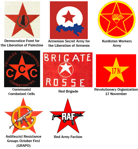
How am I supposed to know what terrorist group put out this video?Terrorist groups, like any organization, need brand identities. With so many groups claiming credit for terrorist acts, and so many videotapes being put out featuring men in ski masks, it’s hard to keep track of which group committed what violent act. So terrorist organizations have logos. It recently occurred to me that someone had to actually design those logos. But how did they decide who gets to do it? Did the job go to whichever terrorist had a copy of Adobe Illustrator?
I did some research and rounded up as many logos as I could find from terrorist groups past and present. While I hate to give terrorists any more attention, I still think it’s interesting to see the various approaches they took in their logos, and wonder what considerations went into designing them. Does the logo successfully convey the organization’s message? Is it confusingly similar to another group’s logo? Does it exhibit excessive drop shadows, gradients, or use of whatever font is the Arabic equivalent of Papyrus?
Quick Disclaimer: I picked these terrorist groups from a list of designated terrorist organizations on Wikipedia. Since Wikipedia is a user-edited website, I can’t verify who decided these groups are terrorist organizations. So if it turns out one of these groups is an actual army or a legitimate non-violent organization, don’t blame me.
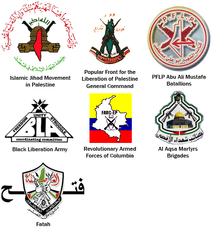
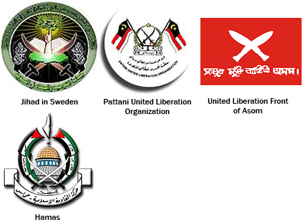
I decided to group the logos roughly by their dominant design elements:
1) Stars
It occurs to me that “stars inside circles” is a subgroup of this category.

2) One Gun
Notice that there’s a little bit of overlap between this group and the last group. The last two “Stars” logos featured a gun, but I decided that the star motif was strong enough to keep them in the “Star” group. The first logo in this group has a star, too, but it’s small.

The bottom three logos are presented in the order they were designed, each inspired by the one before it.
3) Two guns crossed
Why settle for one gun, when you can have two?

4) Other weapons crossed
Guns are so barbaric. Here are some logos which feature blades instead.

5) Crossbones
White supremacists seem to prefer skulls over swords. Hey, haven’t I seen that Combat 18 logo somewhere before?

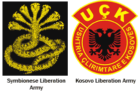
6) Animals with multiple heads
The SLA’s seven-headed cobra, below, was apparently taken from an ancient Sri Lankan symbol.

[Note: There is interesting discussion in the comments below over what constitutes a terrorist group, with the Kosovo Liberation Army particularly being called into question, and comments an both sides of the issue. The BBC has an interesting history of the KLA here, explaining why the US urged Kosovo Albanians to regard the KLA as a terrorist group, and why the Kosovo Albanians stopped short of that designation. I intend no offense by this logo’s inclusion.]
7) Other
What to make of the rest? I’m not sure what the Oromo Liberation Front logo is supposed to suggest. And that “EPB” logo doesn’t inspire terror at all. It looks like an Olympic team logo. I’ve never heard of the Creativity Movement before, and now I still have no idea what they stand for. What’s with the “W”?

Note:This weekend, an Al Qaeda suicide bomber killed 150 people in a market north of Baghdad. Another 250 were wounded. When this news broke, I had already begun working on this blog entry, and thinking of those victims made it hard to finish. So I just want to be clear that, although this entry focuses on a relatively trivial aspect of terror organizations, it is in no way intended to make light of terrorism. The guns, the blades, the maps of Israel, and other elements in these logos do effectively communicate with painful clarity what some of these groups intend. While my overview of terrorist logos is meant half-seriously as an examination of graphic design in a place we might not think to look, I don’t want to minimize the devastation these groups have wrought.
0 意見:
張貼留言